Signs of the times
As the UK road sign celebrates its 50th birthday, we meet the woman who helped create this icon of British design
WORDS: JOHN C SILCOX
PHOTOGRAPHY: NICK BALLON
Motorists only have a few seconds to react to road signs. Usually it’s just enough time to read them, understand their message and use the information to make a vital decision. But it’s not nearly long enough to ponder the nature of these plaques of metal that live all along the 250,000 miles of UK public highway.
If you do, though, you’ll quickly realise that our country’s signage system is a work of genius. Millions of us instinctively recognise that white lettering on a blue background signifies a motorway, a picture of two children holding hands means there is a school nearby, and a black cow in a red triangle warns of a cattle crossing.
The vast range of information conveyed by these simple pictograms is staggering, and it could be argued that road signs are some of the most important pieces of public design work ever created. In 2011, the Design Museum added a motorway sign to its collection, vindicating its status as a design classic. Most people would agree that the Transport font used still looks modern and relevant today, even though it was created back in the 1960s.
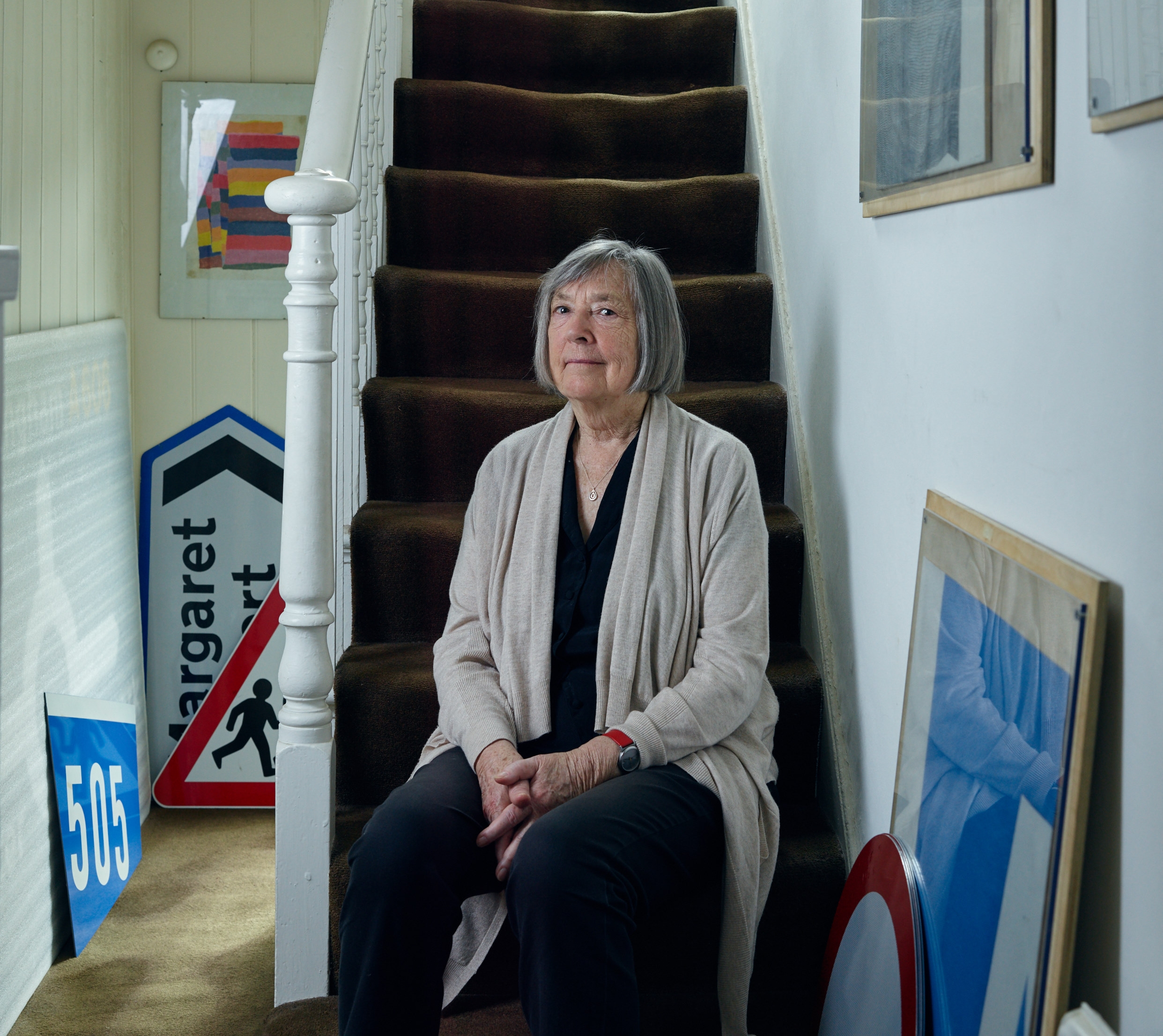
This year we celebrate 50 years since this signage system became mandatory on all British roads. It is the brainchild of Jock Kinneir and his assistant Margaret Calvert, who were given the job of designing a system of signs for the motorways that were being built across Britain. The signs would have to deliver concise information that could be read at higher speeds than ever before.
Kinneir – who died in 1994 – had been Calvert’s tutor at the Chelsea College of Art, and following her graduation, he approached her with the offer of a job.
‘Jock was appointed by the Anderson Committee [formed by the government to oversee the creation of the new signs] in 1958 as graphic design consultant. I’d joined him the year before, having just turned 21,’ remembers Calvert today.
Initially, she had no idea how much work was involved. ‘The first project only related to Britain’s new motorways,’ she says. ‘But a far-sighted civil servant called T.G. Usborne persuaded the Ministry of Transport to set up a second committee, chaired by Sir Walter Worboys, to take Britain’s entire road network into account.’
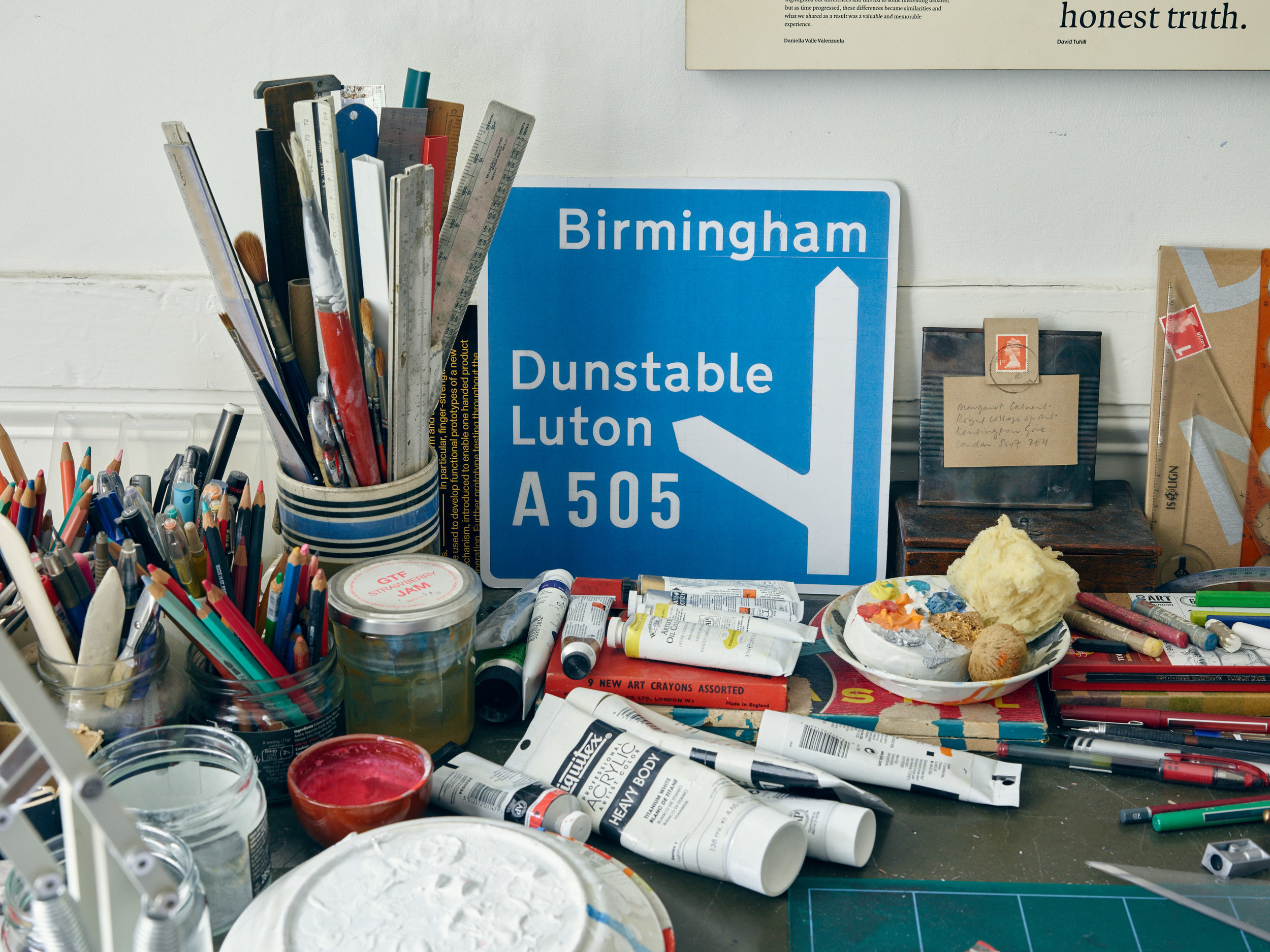
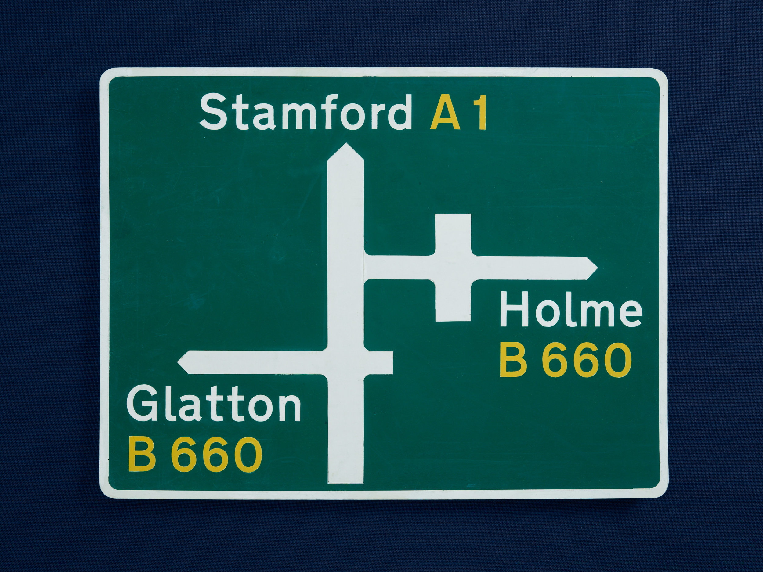
The system Kinneir and Calvert devised to govern the organisation of information also accommodated other classifications of road. It was quite scientific, and the pair ran tests to determine the most effective background colours and reading distances. Their biggest innovation was to opt for a combination of upper- and lower-case letters. ‘Word shape is the most distinctive thing,’ Calvert tells us. ‘If you have a place name in capitals then, from a distance, it’s difficult to read, but in caps and lower case you can recognise the word shape without reading each letter.’
The use of lower-case letters for place names was something quite new in Britain, and came under attack from conservative members of the design community – but the commission backed Kinneir and Calvert in their approach. Apart from some minor modifications and additions, such as the ‘Elderly People Crossing’ warning – which was designed in the 1980s as part of a children’s competition – the system has remained the same. Surprisingly, in today’s age of satellite navigation and computer technology, Calvert’s work is still as relevant as ever: the typeface is now used by the UK government on its official www.gov.uk website.
This all supports Calvert’s views about the ongoing importance of traditional design techniques in our modern world. ‘Although it seems like computers have taken over, basic techniques, such as the ability to draw – which we all once had – can still be an invaluable asset in working through ideas, as well as an end in itself.


